Showing posts with label Rant. Show all posts

1.22.2015

Mickey Hatcher, 1991 Upper Deck


Name: Mickey Hatcher
Team: Los Angeles Dodgers
Position: Outfield
Value of card: Zero new ideas
Key 1990 stat: 13 RBI
We've been here before: In 1991, Upper Deck was still a new brand, full of fresh ideas and energy. That was, until this card got produced. Oh, gee, Mickey Hatcher with a giant glove. How original! Why not go all out and get Glenn Hubbard to pose with a python, ask Jay Johnstone to put on his umbrella hat, and get Jose Canseco to take his shirt off? Yep, this was the moment Upper Deck moved to the cheap seats.
Share/Save/Bookmark

9.10.2014

Willie McGee, 1989 Topps Big


Name: Gah! We mean, Willie McGee
Team: St. Louis Cardinals
Position: Outfield
Value of card: 40 shudders
Key 1988 stat: Even he seemed appalled by himself
Come on, Topps: Look, we understand the point of the Topps Big set was to get both an action shot and an up-close mug of the same player on one card. But maybe you could have just gone with two action shots of Willie? We mean, good lord, nobody needs to see that homely face smiling (is he smiling?) right back at them. Imagine the poor kids who saw this card! Nightmares for weeks, and probably a bout of bed-wetting, too (that was our excuse, at least). It's bad enough that these cards won't fit in our standard-issue card pages, you don't need to torment us with a full-on view of the Chinless Wonder as well. Now, if you'll excuse us, we need to go wash our sheets.


Share/Save/Bookmark

9.01.2014

Frank Tanana, 1987 Donruss


Name: Frank "The Tank" Tanana
Team: Detroit Tigers
Position: Pitcher
Value of card: Even lower than modern-day Detroit property values
Key 1986 stat: One god-awful photo
Here we go: Fine work, Donruss photo team. That's fantastic. Look, we're not going to sit here and tell you that Frank Tanana was the world's most photogenic dude, but come on. This was the best picture you could choose? Let's run down the checklist of bad sports card photography. Camera positioned too close to the face? Check. Use of flash causing the subject to squint and creating the appearance of a sheen of sweat over his entire face? Check. Not asking the subject to tuck away his unwashed bangs or trim his unibrow? Check. Hey, I guess we should be grateful that you guys at least got him in focus, eh? Good job, fellas.
Share/Save/Bookmark

8.26.2014

Jack Morris, 1982 Fleer


Name: Jack Morris
Team: Detroit Tigers
Position: Ace
Value of card: An avocado pit
Key 1981 stat: Zero non-grainy photos taken of him
Wow, what a card: Let's take a moment to thank Fleer for this fine card. The effort and hard work that must have gone into such a fine representation of such a stellar pitcher is mind-blowing. Just think of the countless hours the photographer invested to capture such an important moment. It's not just the artistic acumen required to present Morris in a grainy, out-of-focus image, it's the foresight to picture him not during a game, but throwing in front of a chain-link fence, apparently in a prison yard in southern Michigan. So bravo, Fleer executives, you've outdone yourselves once again.
Share/Save/Bookmark

7.14.2014

Mike Griffin, 1981 Fleer


Name: Mike Griffin
Team: New York Yankees
Position: Pitcher
Value of card: So little, those creases don't decrease the value
Key 1980 stat: Hold on, we're still looking ... looking ... looking ...
This card is so bad, it's time for a rant: Excellent work, Fleer. Once again, you fine folks have outdone yourselves. What a photo choice. So much action. Mike Griffin just jumps off the cardboard and into our living rooms. Few things in sports are more exciting than a pitcher hanging out in the dugout watching a game. Riveting stuff. And don't worry about getting a shot of this guy in his real uniform. Collectors everywhere prefer shots of guys that make them look like they're on a beer league softball team. We must give you kudos, however, for choosing to keep the random flannel guy in the crop. Totally necessary. Well, at least this card has one redeeming quality: Griffin looks a lot like Larry Bird.
Share/Save/Bookmark

7.12.2014

Sean Berry, 1990 ProCards


Name: Sean Berry
Team: Memphis Chicks
Position: Third base
Value of card: One berry, eaten by a baby chicken and then crapped out
Key 1989 stat: Was a Chick
Well, well, another winner: Oh, just fantastic work here, ProCards. We won't even worry about your card design, with the giant block of red not even half-filled with that text that looks like it was stamped on. What the crap is this photo? Did your photographer half-ass it because he was disappointed that the Memphis Chicks were not, in fact a women's baseball team? Or did this consummate professional intentionally have everyone pose so that their faces would be buried in shadow? Whatever the case, one thing is for certain: this whole card was triple-A-ball, indeed.
Share/Save/Bookmark

5.16.2014

Don Beebe, 1989 Pro Set (Football Friday No. 197)


Name: Don Beebe
Team: Buffalo Bills
Position: Wide receiver
Value of card: Prospecting for gold (up your nose)
Key 1989 stat: Didn't fall on head (yet)
It's a Football Friday rant: Oh, bravo, Pro Set. It was so important to get young Don Beebe in your 1989 edition that you had to reach out for a third-party photo, was it? Only, rather than track down a quality picture of the young receiver, you acquired what appears to be a lost image from the Zapruder tape and slapped it on this piece of cardboard. Thankfully, you credited it as a "scouting photo," lest we be concerned that your oh-so-rigorous standards were slipping. Congratulations, gentlemen, your focus on quality is as sharp as ever.
Share/Save/Bookmark

1.02.2014

Mike Laga, 1987 Topps


Name: Mike Laga
Team: St. Louis Lovely Ladies Cardinals
Position: First base
Value of card: It's in the red
Key 1986 stat: One butt chin
A colorful rant: Folks, please put your hands together for the Topps photography and design departments. What we have here is another iconic example of the pre-Photoshop era, when men were men and jerseys were pink — or some such thing. Mike Laga, whose chiseled good looks and million-dollar butt chin make him ideal for the "mugshot" treatment, was traded from the Tigers to the Cardinals in 1986. Apparently, the photo above was either (A) taken during his Tigers days or (B) he was sporting his favorite Morey Boogie hat while striding around spring training shirtless and Topps figured they needed to make Laga appear more ballplayer than surfer dude. We'll take option A, and we'll note that the Topps designers did a pretty impressive job pasting on that red hat. But we have to ask: What in the name of Bob Gibson's gonads is going on with that pink jersey? Well, maybe the designers were infatuated with a certain team in a certain 8-bit Nintendo game called "Baseball Stars."
Share/Save/Bookmark

11.02.2013

Cornelius Bennett, 1994 Coca-Cola Monsters of the Gridiron (Halloween Week 2013 No. 6)


Name: Cornelius Bennett, aka "Big Bear"
Team: Boo-falo Bills
Positions: Linebacker, catching salmon in a river
Value of card: 62 pounds of fish guts
Key 1993 splat: 10 6-inch fingernails
Questionable content: Let's get this straight. Here we have Cornelius Bennett, famed Buffalo Bills linebacker, masquerading as "Big Bear." Let's repeat that: A Buffalo player is dressed like a bear. Wouldn't it make a little bit more sense to have a Chicago Bears player dressed as "Big Bear"? What's next, Mike Singletary dresses up as "Blitzing Buffalo"? But, given the quality of this get-up, it really doesn't matter. Bennett looks more like a buffalo than a bear, anyway. That dangling hair. Those long, pointy nails. That beard. Oh, wait, Bennett doesn't look like a buffalo or a bear, he looks like a hairy guy named Bill who has eaten too many bear claws. Solid execution, Coca-Cola. Your lack of attention to detail is, once again, frightening.
Share/Save/Bookmark

8.13.2013

Pete Rose, 2012 Upper Deck Goodwin Champions (Goodwin Champions Week No. 2)


Name: Pete Rose
Team: Cincinnati Reds
Position: Outfield/infield/child laborer
Value of card: A 5-year-old's drawing of poop
Key 1977 (maybe) stat: Never actually looked like this
Just stellar work, Upper Deck: What the hell is this? We thought these illustrations were supposed to be life-like. Instead, we've got what appears to be an oil painting made by a sixth-grader of Pete Rose wearing a velour track suit and a gold watch. What, is he Tony Soprano's dimwit underage bodyguard? It seems as though Rose has gnawed off the outer edges of those bat barrels like a beaver and mashed the damp shavings together to create the wig on his head. And is that a baseball glove he's carrying in his other hand? It looks more like some sort of poorly constructed wicker basket. At least the look on Rose's face seems legitimate, although it's more likely that he had that expression of disappointment and constipation after viewing this portrait. Really, excellent job, fellas.
Share/Save/Bookmark

7.08.2013

Will Clark, 1989 Score Superstar


Name: Will "The Thrill" Clark
Team: San Francisco Giants
Position: First base
Value of card: The stitching from the inside of a sweaty butt pocket
Key 1988 stat: 14 "thrills" (with the ladies)
Great card, right? Hey, this is an awesome late-1980s William Nuschler Clark card. Nothing like a photo of a player where you can't see his face or the name on his jersey. Creases, smudges and bent corners aside, it's in perfect condition. And check out those three totally radical triangles framing the W in The Thrill's name: thrilling. At least, for the ladies, you get a nice crumpled-pocket butt shot. Score should have put out more subsets like Superstars. What an idea: Take a mediocre photo you already have, throw on a boring red-and-blue border, flush it down the toilet and voila, you have another subset that you can use to take money from kid collectors' allowances. Score? This card is anything but.

Card submitted by Travis Johnson
Share/Save/Bookmark

6.19.2013

Billy Cowan, 1972 Topps


Name: Billy Cowan
Team: California Angels
Position: Outfielder
Value of card: In heaven, earthly goods hold no value; this card, on the other hand, holds no earthly value on Earth
Key 1971 stat: Four hours, 15 minutes setting up the perfect shot
Take a bow, Topps; take a bow: Well look what you've done. You're fabulous, aren't you? Just look how clever you are. Let us be the first to congratulate you on being the wittiest baseball card company in the world. Sure, it took 41 years for someone to tell you you're the best, but we care. We care, deeply. We care so deeply, in fact, that we're going to help you out with your little joke: We drew wings on Cowan's back, covered him in silken robes and surrounded him in an ethereal glow. Here you go. Congratulations again.
Share/Save/Bookmark

5.14.2013

Fred Breining, 1985 Topps


Name: Fred Breining
Team: Montreal Expos
Positions: Pitcher, stuffed in locker
Value of card: Hard to see any value here
Key 1985 stat: Didn't play a game in the big leagues
More great work, Topps: Here we have Fred Breining, one of the least photogenic people to ever walk the Earth. The 18-pound glasses, the flowing blond-ish mullet, the sense that he can't actually see anything in focus, even with those spectacles. But where Topps really takes the cake here is with Breining's "outfit." You see, the pitcher was with the Expos all of the 1984 season. Sure, he only played in four games due to a shoulder injury, but apparently Topps was unable for more than a year to get a photographer north of the border to get a shot of him, even just standing around. Instead, they bestowed upon us this treasure, showing Breining, clearly in Candlestick Park, with an airbrushed hat and a jacket so heavily doctored it looks like he's wearing a satin sheet as a cloak. That's just great, guys, you should really take pride in this effort. *puking sounds*

Card suggested by Tyler Kepner
Share/Save/Bookmark

4.19.2013

Junior Seau, 1992 Upper Deck Fanimation (Football Friday No. 157)


Name: Junior Seau, aka "The Warrior"
Team: San Diego Chargers
Position: Angry linebacker
Value of card: A pile of robotic body parts
Key 1992 stat: Right leg not amputated at knee, despite what this card shows
Real nice, Upper Deck: So, among the many ridiculous premises of the Upper Deck Fanimation cards was the notion that these stars were battling some sort of evil droids in various sports. Riiight. The thing is, that sure looks like blood and gore      not oil and gears      on Seau's fist. And are those wires spilling out of that severed arm in the lower left, or are they tendons and skin? Great, Upper Deck, you've decided to give the kids nightmares about their favorite athletes literally ripping their opponents limb from limb, soaking in the carnage.
Oh, and another thing: Really, "The Warrior?" You already used that one for Dikembe Mutombo. Look, just because these guys' family histories extend beyond the borders of the U.S., doesn't mean it's OK to just nickname them all "The Warrior." One thing's for sure: No one would ever call whoever drew this atrocity "The Artist." Blech.
Share/Save/Bookmark

11.13.2012

Alex Arias, 1993 Topps


Name: Alex Arias
Team: Florida Marlins
Position: Infield
Value of card: A blue piece of construction paper
Key 1992 stat: Zero Marlins franchises for another year
Another stunning accomplishment: We have to hand it to Topps. The Marlins major league franchise hadn't played a game before the 1993 season, but somehow the card company figured out an ingenious way to capture the action of the game and the players in their fledgling team's uniforms. Wow, what an accomplishment. Can you imagine how many meetings of the best and brightest at Topps it took to come up with such a brilliant idea? Just look at that background: stunning. And how smart is it to have the player sit there with a bat? The genius boggles the mind. And, as if they hadn't already showcased their smarts enough, the Topps brass had Arias look at the camera and smile. Wow. Again, we're awestruck by greatness, and, today, we're standing here slack-jawed against a background of blue.
Share/Save/Bookmark

10.20.2012

Juan Pierre, 2003 Fleer Tradition


Name: Juan Pierre
Team: Colorado Rockies Florida Marlins®
Position: Outfield
Value of card: It's not worth trading for
Key 2002 stat: Bunted a lot
Great moments in card design: Not too long ago, we highlighted the most boring card set ever produced. Apparently, card designers didn't learn much in the 13 years between that set and this one. Take a bow, Fleer. While the excessive white border is truly thrilling and the program-default sans serif font captures the eye, what really gives this card life (aside from Juan Pierre's mustache) is the dramatic, yellow "TRADED" diamond jutting up into the player's knee. I'm sure that giant block of random color seemed like a good idea at the time       actually, no, I'm not sure of that at all, because it's absolutely hideous. Congrats, Fleer, you've ruined yellow for everyone once again.


Share/Save/Bookmark

10.10.2012

Calvin Schiraldi, 1990 Topps


Name: Calvin Schiraldi
Team: San Diego Padres
Position: Pitcher
Value of card: An old disposable camera with no film left
Key 1989 stat: It wasn't 1986
Time for a rant: Hey, nice photo here, Topps. It's amazing you were able to get this picture considering that it looks like the stadium behind him was being vaporized. Or was the horrendous background exposure your way of keeping Calvin Schiraldi's location a secret, confounding any Red Sox fans who might have wanted to take revenge on the losing pitcher of Games 6 and 7 of the '86 World Series? If so, that's fine work, because it's barely even possible to tell that this is a ball field. But, hey, at least you got a great shot of Schiraldi himself. What, you couldn't find more brown shirts to swaddle this guy with? Did you even tell him it was photo day ahead of time? The poor S.O.B. looks like he just woke up on the locker room floor after a night of shooting cherry-flavored vodka with Eric Show. Card collectors everywhere must have been really proud to acquire this gem.
Share/Save/Bookmark

9.26.2012

Frank Thomas, 1992 Pacific Coast Sportscards ("Fabulous" Frank Thomas Week No. 3)


Name: Frank Thomas
Team: We know it's the Chicago White Sox, but that's not indicated anywhere on the card
Positions: First base, designated hitter
Value of card: One drawing of a fake-gold necklace
Key 1991 stat: Two girlish eyelashes
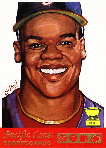
Oh, yeah, here's a winner: Wow, what a legendary piece of garbage. Twenty years after the fact, it's hard to believe that someone would spend the time to produce this card. And it's harder to believe that this card probably made that scab at least a few thousand dollars. It's not just the crude illustration by fourth-grader lil' Eddy David. Well, actually, that's a big part of it. Frank Thomas was a masculine man, but here he looks like his makeup was done for junior prom. Thomas played for the White Sox, and not only is there no mention of the team on the card, but he appears to be wearing a Cubs uniform. You see it? It's right there, underneath the absurd depiction of a grandmother's gold necklace. But let's put away this waste of watercolor for a moment and focus on the brand. Pacific Coast Sportscards, huh? We're pretty sure they made one card, and it featured a player whose team's home was about 2,200 miles from the Pacific Coast. And one last thing: Apparently, Pacific Coast Sportscards seems to represent four sports. In the gold-plated cutout, there's a basketball, a baseball, a football and, um, a mushroom? Well, you'd have to be 'shrooming to think this card was a good idea.
Share/Save/Bookmark

7.27.2012

Joe Montana, 1989 Living Legend (Football Friday No. 130)


Name: Joe Montana
Team: San Francisco 49ers
Position: Greatest quarterback of all time
Value of card: Phlegm caught inside a mouth guard
Key 1988 stat: 816 passes completed with pinky sticking out like he was at an English tea party
Let's put our hands together: Now this is something else. What an accomplishment. C'mon people, let us join together and salute the fine folks at ... uh ... uh ... there's not even a company listed on this god-foresaken card. It says "Living Legend" in comic sans on the back, which might somehow be a step up from the front, but it doesn't list the fourth-graders responsible for unleashing such a fit of failure upon the masses. The nameplate looks like it was typed on a 1986 label-maker. And the border is blue. Blue! This was, no doubt, a one-card set. Didn't these geniuses think that red or gold would be a better choice? Oh, sorry. They must have been too busy not putting any effort into a "Living Legend" that was dead on delivery.
Share/Save/Bookmark